
🌈 how to choose a color palette for your flower garden or landscaping 🌈
color theory & inspirational images for our year ahead


My first experience with color theory was a Color Theory course my freshman year of college. I was an honors art student at a state college, which means for half of your time you hang out with people who inspire you to get a nape piercing - and the other half of the time you take on enough stress to tranquilize a bull moose. Ironically, art class homework takes at least triple the hours of honors anything.
Our first class, everyone brought in large bodies of work to show their current style. I remember being absolutely shocked. I was homeschooled by a mom who was very into watercolors, but these kids had completed four high school years of real art classes whose outputs could have landed them in museums on the spot. I felt silly and embarrassed, woefully unprepared for the emotional concept of group critiques.
But, I had a gift for mixing colors rapidly and an instinct for being able to deconstruct which tubes had been used to get any color I was looking at. I lived, breathed, & slept that class until the day my professor gave me a B for integrating a layer of written words under the paint of a portrait. “This is a painting class, adding words make it Not Real Art.”
I was out. I want to know every single rule, and I will never follow them all. I want to understand how everything works, but I will do what I want.
Why create if you cannot play?

I have avoided refreshing my understanding color theory for garden design because some Internet Randoms have said it’s just not that helpful. But recently, I have been digging in, and it is in fact extremely helpful - so I thought I would share a very basic version here.
When possibilities are endless, parameters are a GIFT. Choose a direction and follow it to 95% - and then make exceptions as your heart (or eyes) desire.
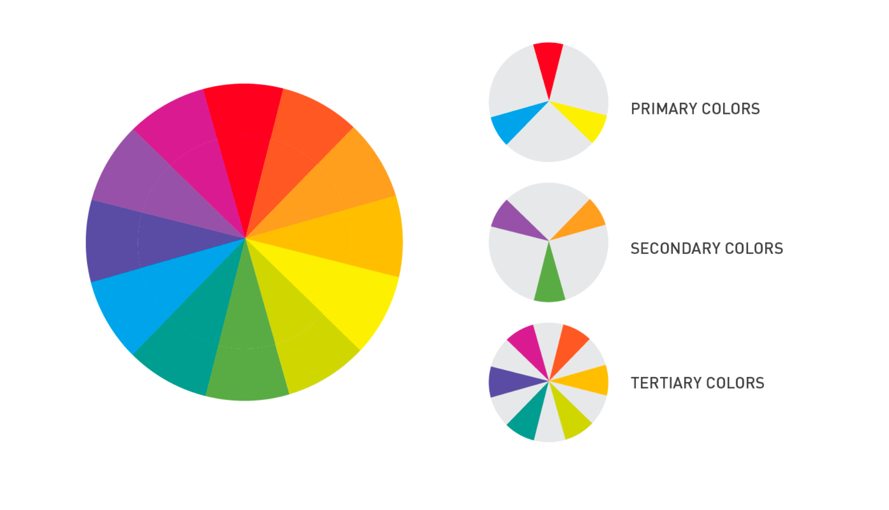
As a refresher, our primary colors are blue, yellow, and red. When you mix two of them equally, you get a secondary color. And when you mix unequally (eg. just a tad bit of blue with mostly red), you get a tertiary color.
If you’ve been collecting flowers and your space doesn’t feel cohesive, or you don’t know what your “vibe” is, or you don’t have a preference but you want your flowers and shrubs to look good with your new home — choosing a color scheme can really help.

MONOCHROMATIC
One of my favorites is a monochromatic scheme. It’s daring and gets attention 10 out of 10 times. Most of us don’t “love one color” enough to commit, but you could try it for a year or two, and then build into another color scheme if you wanted. I have found monochromatic to be most effective in small areas. The hardest color to do this with is true pink.
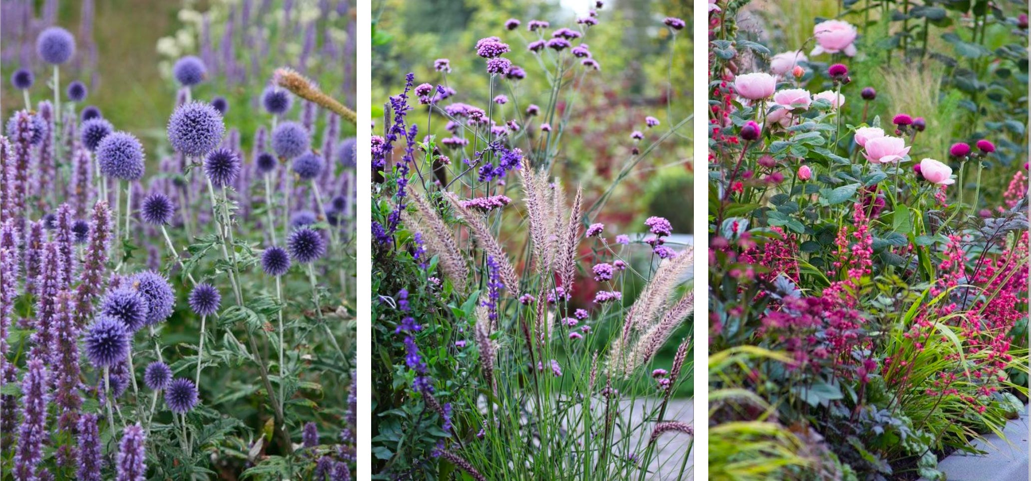
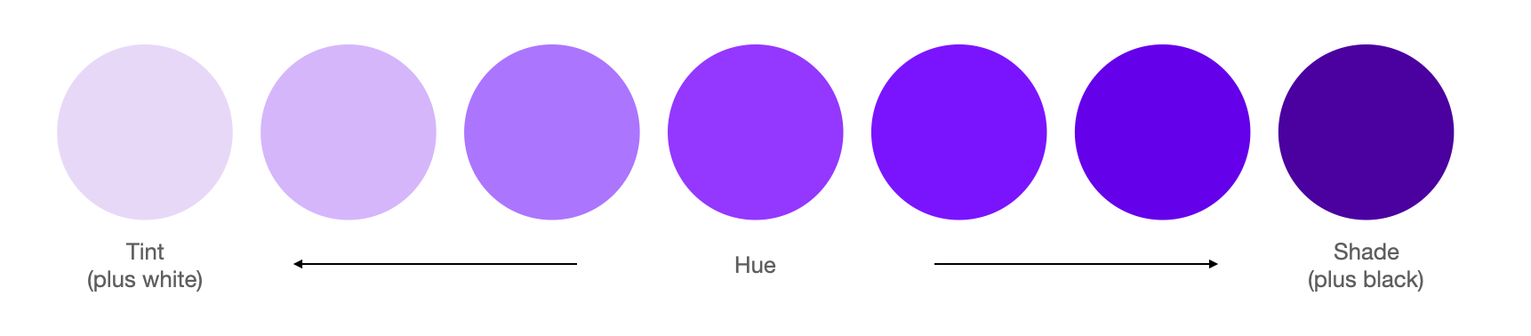
The trick to monochromatic planting is getting depth through varying levels of saturation in your color. For example, if you choose purple as your color, including pale pastel purples all the way through rich, deep jewel toned purples.

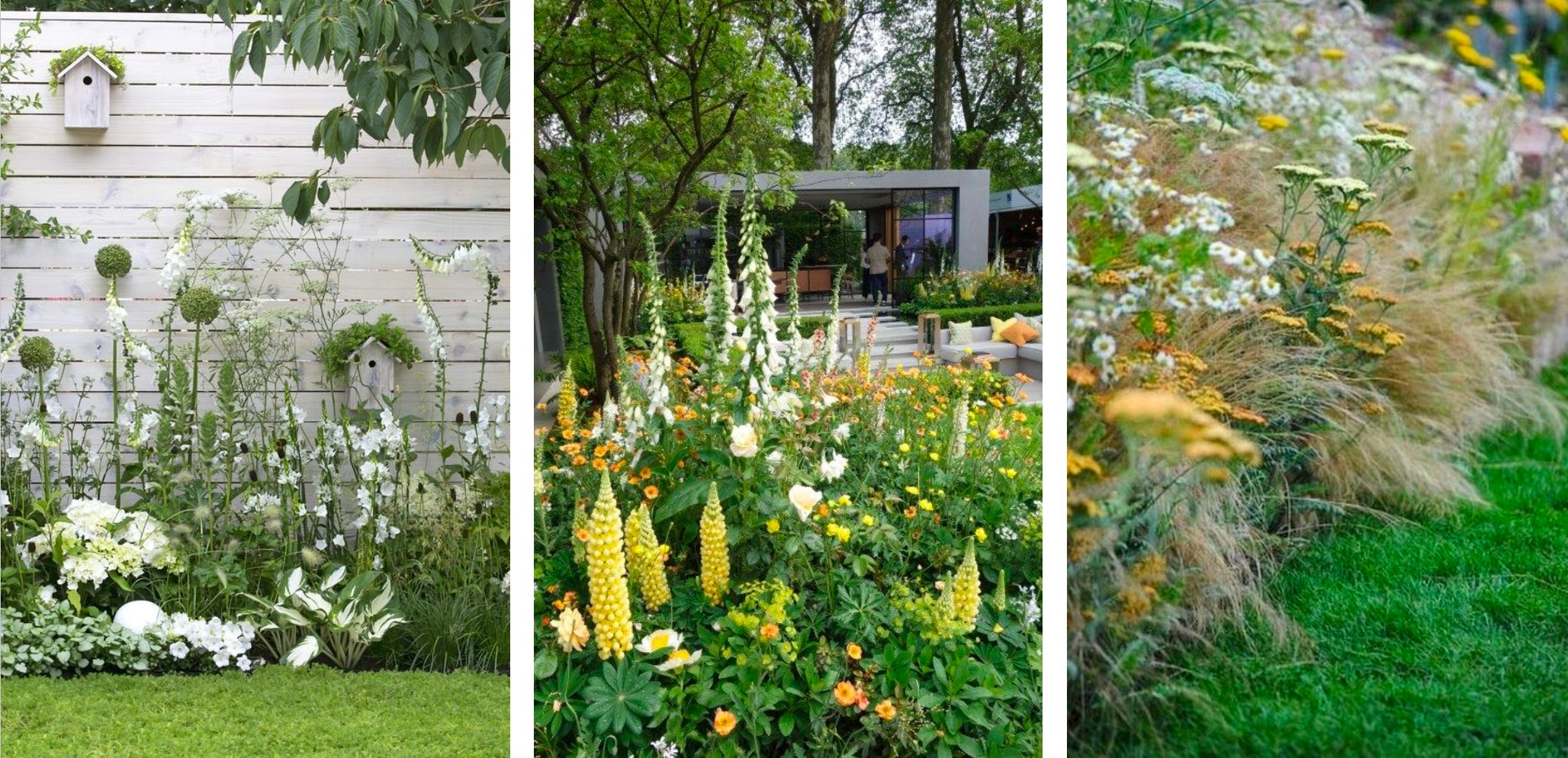
SIDE NOTE: THE ROLE OF GRASSES, FOLIAGE, & THE COLOR WHITE
The above images showcase how many different effects you can get with the same exact color scheme. Adding lots of small white flowers and/or grasses can add an ethereal effect - especially when you are gradually fading into white through pastel versions of whatever color you’re working with. Adding grasses can make a scheme look more refined or more “complete,” while leaving them out can give a sense of more immature/playful (middle image).
Whites are stunning on their own. They function as a neutral when you fade into them. They can be very harsh if dropped in against other bright, jewel toned colors; for example hot pink + white is high contrast, as is red + white, or deep purple + white.

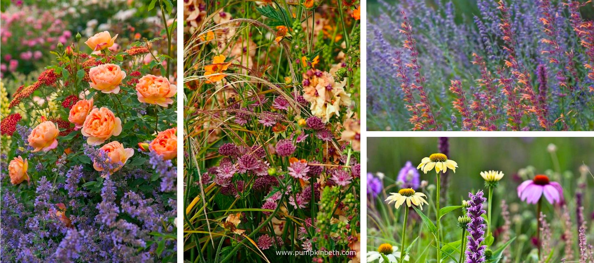
ANALOGOUS COLOR SCHEME
The Analogous scheme is the easiest way to get a breadth of colors into your garden with the least amount of likelihood of clashing or accidental dissonance.
It’s created by selecting 2, 3, or even 4 colors that are all right next to each other on the color wheel. If you’re a new or nervous gardener, this is your color scheme! 😂 Blending all the warm colors (above) or all the cool colors (below) creates what I think is an absolutely gorgeous look.

*Note that “Red Violet” (or “Pink”) bridges warm and cool, so pay attention if it has more of a red undertone (warm) or purple-y undertone (cool).
**Also note that Blue-thru-Green Analogous schemes often appear monochromatic since it is typically the foliage contributing to the green, but this could also be a building, garden art, or fencing.

COMPLEMENTARY COLOR SCHEME
This is created by pairing colors opposite one another on the wheel.
One way to use the example pairing above would be to plant combinations of blue and orange flowers. Another way would be to plant only orange flowers if you lived in a blue house! When choosing a scheme, considering your home as one of the colors can tie your property together. (Brick is a dark “shaded” red, cream siding might be a very pale “tinted” yellow or yellow green or blue - look for the undertones!)
Complementary schemes add harmonious tension, which is the best thing you can create in design!

The two Complementary groupings above ^ show that you can choose a color palette but stay on bright jewel tones (Group 1) or select much paler flowers for a softer, more vintage look (Group 2).
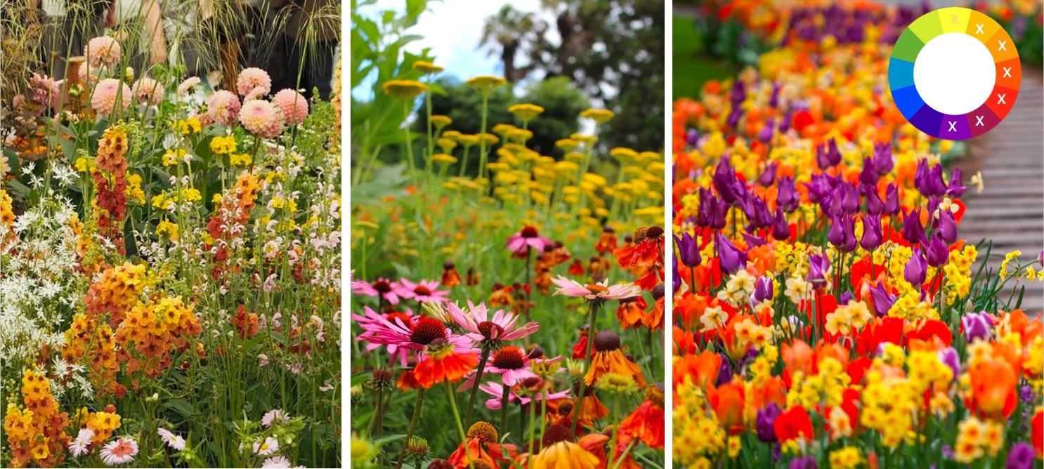
An Analogous example of more saturated vs desaturated colors is below. This is a key takeaway for people wanting more vintage or english cottage style gardens, but wanting more color choices than traditional pinks/blues.
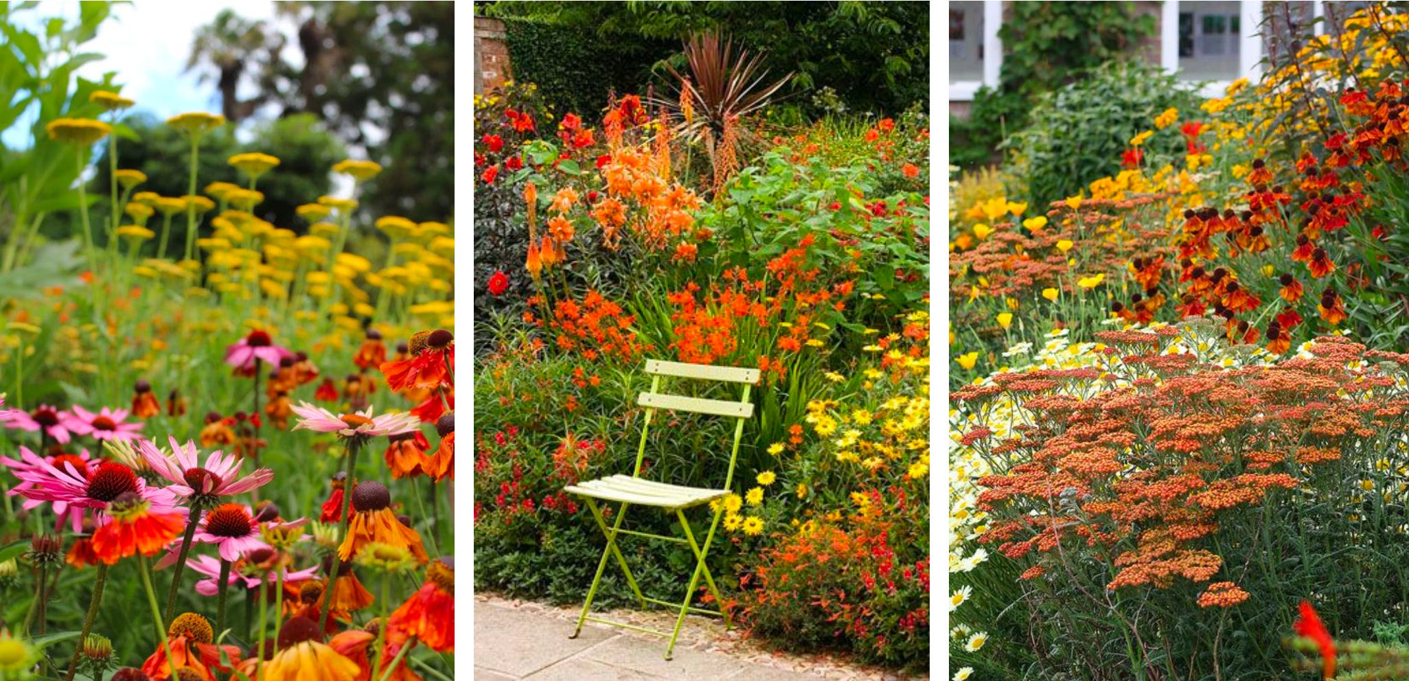
PRIMARY SCHEME

This is created by using all 3 primary colors: red, blue, and yellow. It reminds me of the 90s, and cheap commercial landscaping (left images) — but the center image shows how much more tastefully it can be done when better balanced with smaller blooms and more foliage — and the right image shows how playful it can be when the primary tones are downplayed by offsetting with white, and wildflower varieties are used.
PS. If you are a more advanced color theorist or working hard to learn this, you’ll notice the two images on the right are more split-complementary, but I’m not trying to melt our minds over a flower email.
RIOTOUS SCHEME

DO YOU JUST LOVE SO MUCH COLOR YOU CANNOT SAY NO TO ANYTHING? Riotous is for you! Designers with an exceptional eye can wield this scheme carefully to create the most dynamic gardens, but it is a challenge to do so and trick your eyes into seeing harmony. However, even a haphazard approach can create a space full of joy and fun.
If you have felt your garden is “busy” and don’t know why, seeing these images can also help explain why “combining all the colors” make it difficult for the eye to know where to go.

GENERAL TIPS
When mixing colors, they don’t need to be in equal amounts. If you want an orange & purple garden, consider having 2/3 of the flowers be one color and 1/3 be the other. “Lead” colors really help your eye.
Learn to get excited about plants used primarily for foliage! (euphorbia, jack frost, artemisia, ornamental grass, sedums) These plants should be between 1/2 and 1/5 of your area, depending on your desired style.
Dark purple foliage makes a great backdrops to add depth (shrubs: loropetalum, smokebush. perennials: heuchera, elephant ears, japanese painted ferns)
Do not be afraid of planting the wrong thing! Perennials are easy to move, and your backyard palette can be completely different than your front yard. Plus, if your instinct says something looks beautiful even though it doesn’t make sense on the color wheel, you’re probably right.

SCHEME / PALETTE IDEAS
If you want English Cottage style…
Decide first you want cool tones or warm tones
Cool tone tends to be soft pinks, blueish purples, & whites — but add very pale muted yellows to give some depth
Warm tone tends to be pale yellows, creams, peach, pale blue-violet, warmish purples, etc
If you want a Monochromatic garden…
Focus on variety of plants. You want as many styles and sizes of blooms as possible - and lots of varying heights.
Focus on foliage tones & textures. Add grasses and silvery green leaves.
If you want a blended herb & flower garden…
Most herbs have pale purple flowers or purple tints to leaves, so work off this.
Go monochromatic by pulling in flowers with deeper purple blooms OR
Go monochromatic by adding all-white flowers OR
Go soft-complementary by adding pale orange and yellow flowers OR
Go bold-complementary by adding darker purple blooms and bright orange flowers
For a high-energy garden…
Choose a scheme that incorporates many pure-hue (bright) colors on the warm side (yellow, orange, red).
For a peaceful garden…
Choose monochromatic or analogous scheme and stay with soft, muted colors or pastels.
If you have a brightly colored house…
Look into split-complementary palettes and use your house as the base color. Then, choose flowers that are the same base color with two secondary colors.


There are a thousand ways to design a garden, and all of these rules are meant to be broken. There are more complex color schemes you can research, but so often the best way to learn is find a photo you love and learn to copy it.
Gardens change and evolve every single year, and your experimentation will never be permanent.
My hope is that this email gives new ideas for what your space could become and helps you be even 10% more confident in how you think about all the colors in your yard.
Until next time,
Lauren
“Where are these men? Asleep beneath their grounds:
And strangers, fond as they, their furrows plough.
Earth laughs in flowers, to see her boastful boys
Earth-proud, proud of the earth which is not theirs;
Who steer the plough, but cannot steer their feet
Clear of the grave. “ - Ralph Waldo Emerson, Hamatreya
This is so informative and inspiring! Amazing! Thank you so much!
Thanks so much for this helpful refresher course on color! I'm definitely going to keep referencing this post as I choose seeds and plants this spring and summer!